Miller Signs, Inc.
Website Redesign
8 minute read
The Basics
Synopsis
Miller Signs was in desperate need of a new website that would reflect their growth as a company and also be more user friendly for the owner and end users. I came to the rescue and completely redesigned and built a new site that was not only modern and adaptive but also user friendly.
Note: The design shown here has since been replaced with one from a local web development company.

My Role
- User research, space design, rendering
Platform
- Mobile & desktop
User & Audience
- Kris Miller, owner
- Existing and potential customers
Tools
- Design management, ethnographic research, persona creation, storyboarding, rapid prototyping, user testing, high fidelity mockups, space planning
- HTML & CSS coding, WordPress, Adobe Creative Suite, SmartDraw, Balsamiq, Excel, Quicken
Constraints
- Program timing was behind schedule
- Zero budget
- Disjointed teams
- Technical feasibility
Special Thanks
- Kris Miller, Katrina Losey, Mary Poorman
Research
Objective
Identify user pain points and opportunities to improve the feature set of the existing Miller Signs website.
Parameters
- What: Existing Miller Signs website
- Who: 25 potential and current Miller Signs customers
- Where: Local coffee shop, 10am-11am, M-F for one week
Testing Tasks
- Contact miller signs
- View available services
- View past projects
Methodology
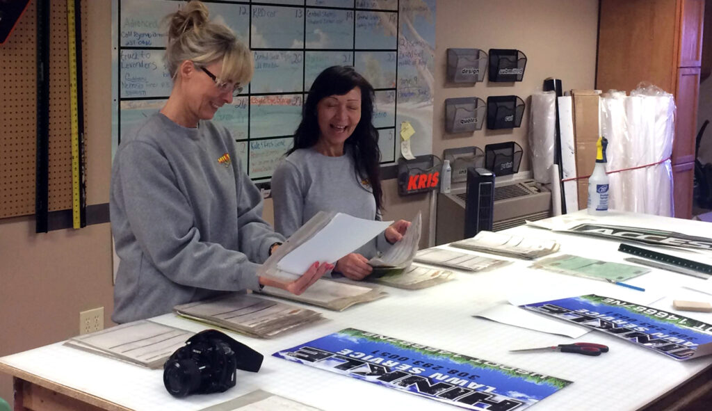
- client meeting
- user interiews & surveys
- usability lab studies & shadowing
- market review
Client Meeting
Meeting with the client is an important part of the project. While the research findings will provide the best insights on potential usability and structure improvements, the client meeting will help define project parameters such as setting goals, project expectations, budget, visual appearance, and timeline.
Sample Questions
- Why do you want a new website?
- What are your short- and long-term goals?
- What do you want the website to accomplish?
- Is there a certain look and feel that must be used for the website?
- What social media tools, if any, do you want to include?
User Interviews & Surveys
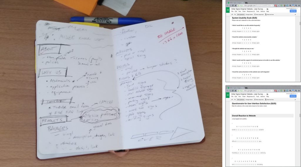
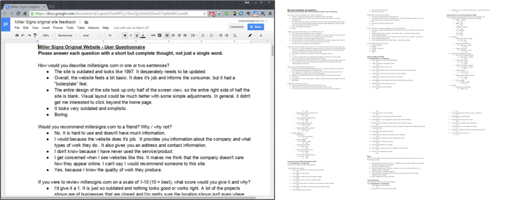
Doing one-on-one interviews and surveys with participants not only provides basic usability feedback but also simple quantitative data as a starting point for developing the new site.
Sample Interview Questions
- How would you describe millersigns.com in one or two sentences?
- What is the most important information to you on a business’s website?
- What do you find frustrating about millersigns.com?
- What features could you live without?
- What features could you not live without?
- What do you look for in the overal usability (how you look and click through a site) of a website these days?
- What is the first thing you look for on a business’s website?
Survey Methods Used
- System Usability Scale (SUS)
- Questionnaire for User Interface Satisfaction (QUIS)
- Computer System Usability Questionnaire (CSUQ)
- Words (adapted from Microsoft’s Product Reaction Cards)
Usability Lab Studies & Shadowing
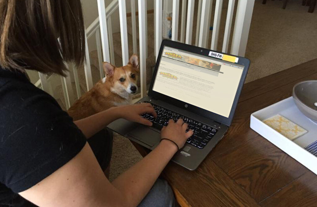
Doing usability studies and shadowing allows for deeper personal insights from users and a higher amount of information to be gathered through use observations.
Sample Shadowing Tasks
- Find the business contact info
- Send an email to Miller Signs
- Show me what products they offer
- Show me examples of older projects
Market Review
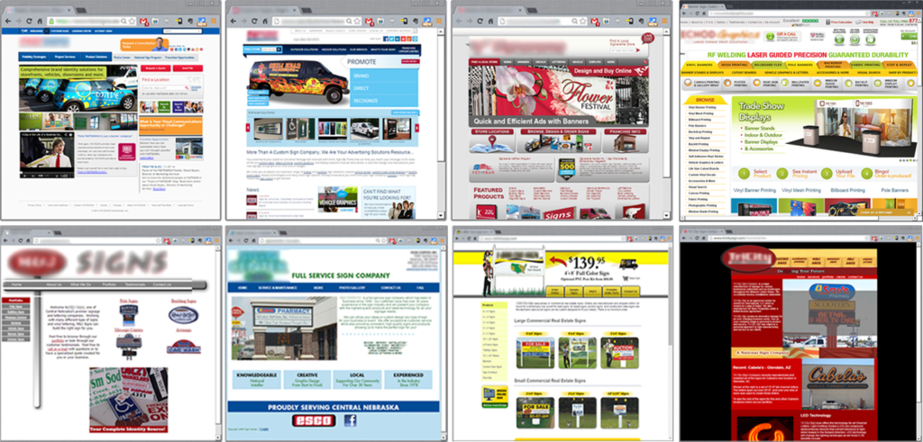
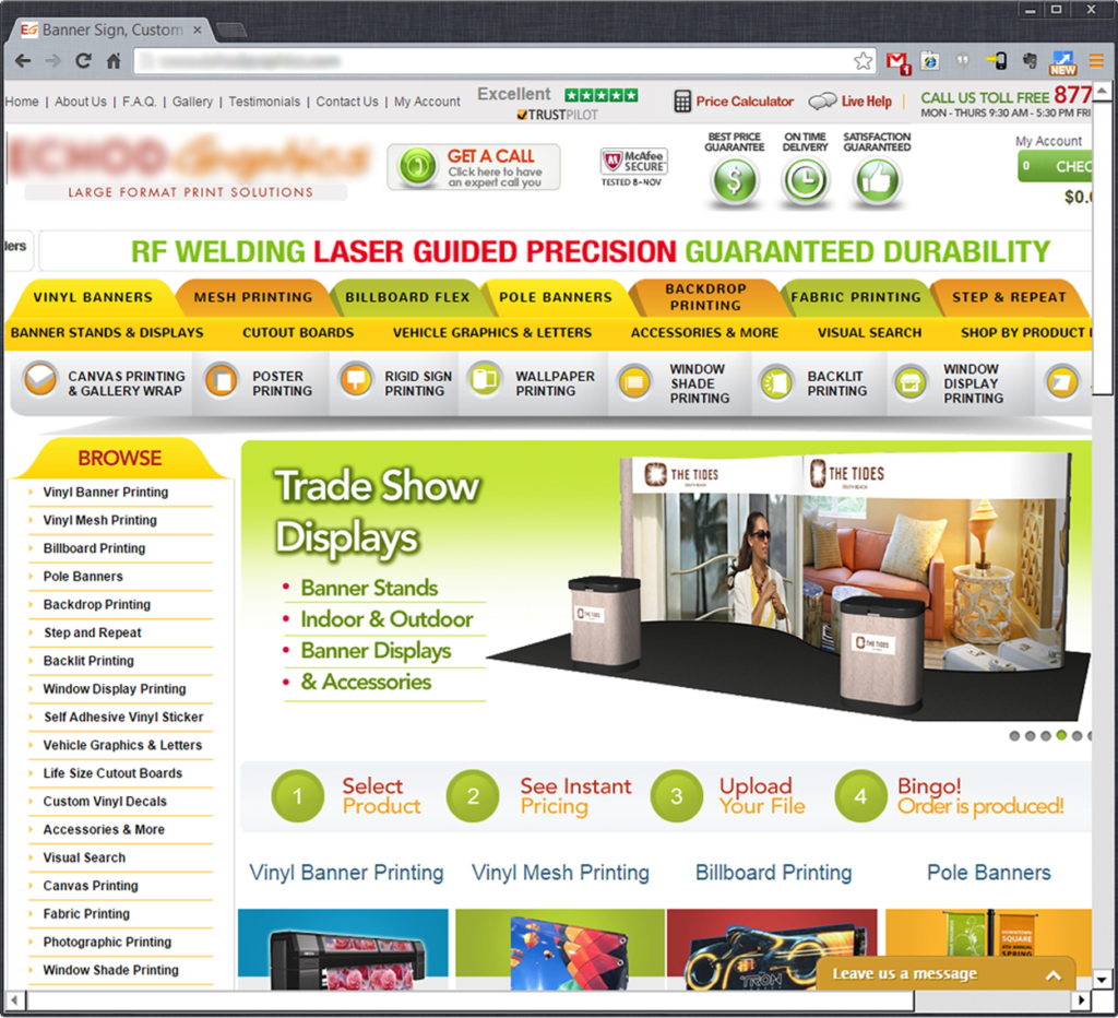
Competitors’ websites were reviewed by both user participants and myself to gain basic feedback on the pros and cons of their online service offerings.
Insights
The research findings are synthesized into usable data that can then be turned into actionable design solutions.
The Competition
Identifying other area sign companies and analizying their current virtual presence helped me to gain insight as to what the current competitive offerings looked like. Larger national sign companies were also analyzed to see how companies of different sizes approach their online branding.
Negatives of the competition’s websites:
- information overload
- static site structure
- outdated web layouts
- no differentiation between sites
- navigation redundancies
- little to no visual hierarchy of needs
- gimmicky animations and site details
Personas & Needs
Example Personas
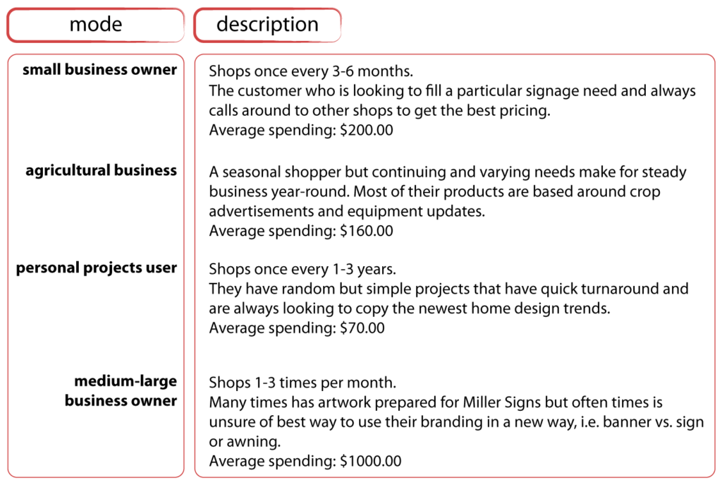
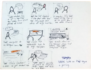
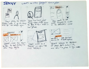
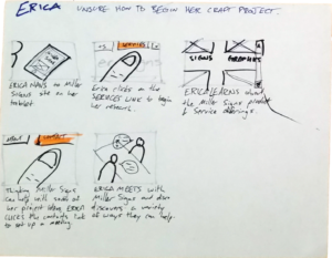
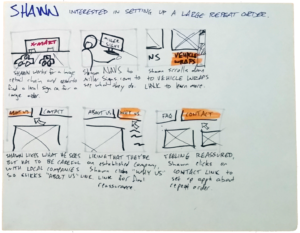
Personas are ficticious users created to personify various attributes discovered during the research process. Their main goal is to provide the client with a face and back story to base the solution’s user needs on. Shown here are four personas that I developed based on the behavior modes shown below. Each is a conglomeration of various user needs and research findings condensed into one “person.”
Needs-Based Directives & Solutions Architecture
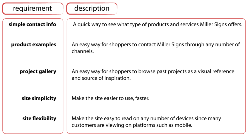
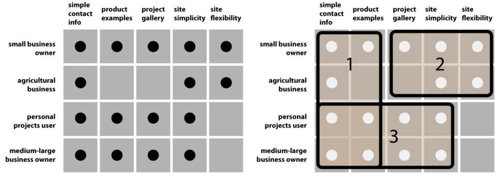
The needs cluster matrix provided me with a clear view into the top needs of the typical user.
1) Make the site simple to use
User studies and interviews all revealed the same basic problem with competitors’ websites: they just have too much going on. Visual confusion + information overload = user aggravation and loss of a sale. With one of the goals being to increase web traffic, this was a major issue that had to be addressed.
2) Make contacting simple
Research showed that the #1 thing people look for in a company’s website is basic contact information. With that in mind, finding an elegant way to clearly integrate the company’s contact info into the landing page was a top priority.
3) Make it easy to view past work
With a sign company, the money is made on very visual work so people naturally want to see what the company has done. A good gallery will help solve this problem and ultimately bolster sales.
Ideation
Brainstorming
After the research and persona development it was time to start the layout of the site.
A brainstorming session with the client helped bring to light a number of ideas that I wouldn’t have thought of on my own. It also allowed the client to claim an ownership stake in the new site, a process I feel is very important.
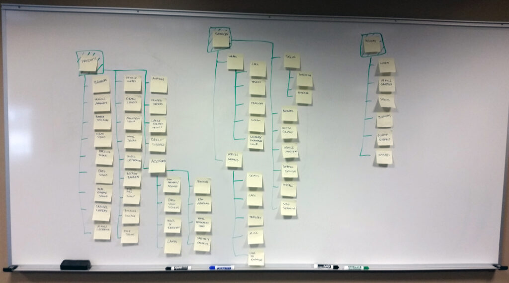
Card Sorting
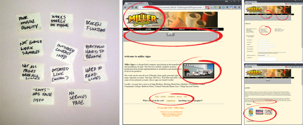
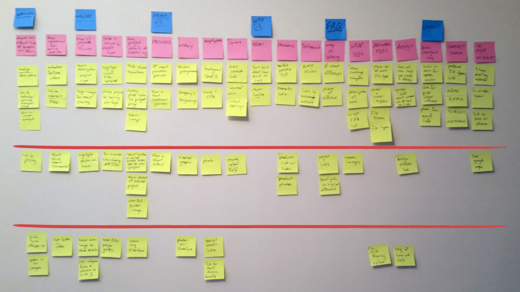
Again with the client, we began clustering ideas into various categories that could help define user needs, hierarchies, and interface behaviors. The goal of this phase was to define the website user’s most immediate needs and pair them with possible tech solutions. This would ultimately give us our final product.
Scenario Mapping
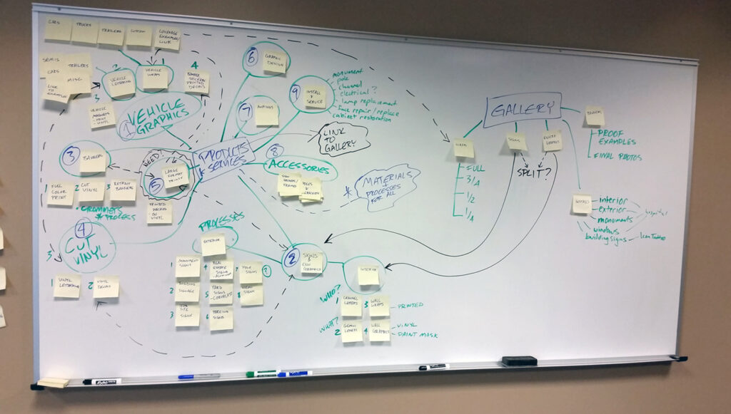
Scenario mapping is a very important part of my design process. Using a whiteboard and tall stack of Post-it Notes allows for the creation of several organizational scenarios in a short amount of time. I love this method due to its cheap cost, large scale (making it easy to photograph and share), and ability to easily work with others on a team as opposed to on a sheet of paper.
Testing
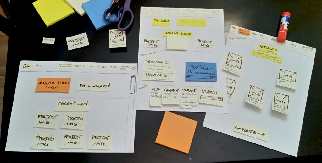
Simple yet effective “paper” prototypes were created to quickly and easily run design and layout ideas with the client.
User Feedback
Overall, the feedback was pretty successful. While it isn’t always easy to hear an idea is bad, it is important to seek feedback and take it seriously, as the end result will more successfully align with overall user needs.
Changes were fairly easy to make since the initial models were all made with quick, easy to change methods. Some change highlights include:
- Basic layout shuffling
- Minimizing the company branding to put focus on the work
- Deletion of insignificant sections to minimalize the overall site structure
Planning & IA
Design planning is an important part of the overall process, as it helps organize the remainder of the site build and increases personal accountability for staying on schedule.
The initial process involved prioritizing the user requirements to determine at which phase which ideas could be implemented. From there I was able to start breaking down that information into a usable site structure that would support the user’s needs as well as the current web standards.
Information Architecture
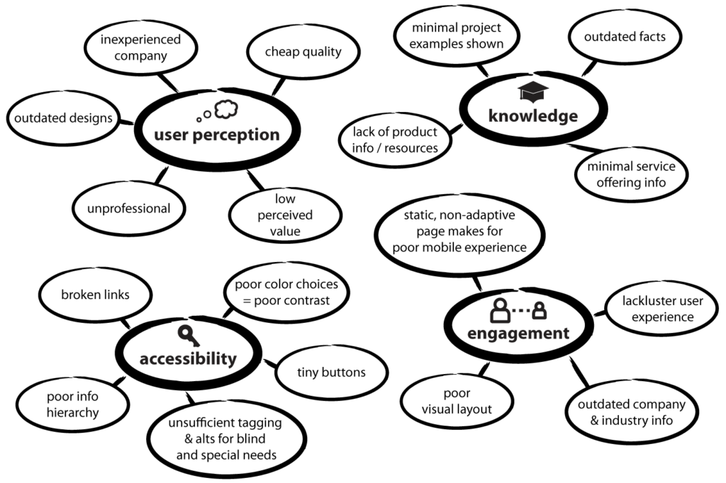
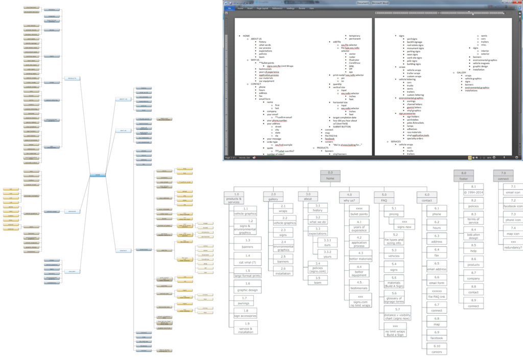
From the whiteboard I was able further refine the site’s navigation and content structure. “Products & Services” was funneled into one section entitled “services” to help simplify & condense the section. The mind maps and site maps were made using SmartDraw.
Shown clockwise from top left: A mind map to help sort and filter the research data; a simple outline of the site navigation for quick reference; a site navigation map. Software: SmartDraw.
Launch
Two necessary criteria the updated site had to meet were adaptability across all current screen formats and the ability of the client to edit and make changes as necessary. The simple solution for both of these issues was to build the site in WordPress. By using WordPress allowed me to do the initial build in full html5 and css3 compliance while still giving the client full access to add projects or make copy changes later. The use of a pre-design design template helped me to create a layout that would remain adaptive yet still make the site more visually appealing and highly usable.
Features
- Footer continuity throughout the entire site
- Search bar in footer makes it accessible but not in the way like a header search would be
- “Back to top” scroll tab automatically appears when scrolling down
- Top header auto-hides when scrolling down for cleaner, easier access to top nav top nav
- Collapses to an accordion menu when shrunk down to a smaller browser window
Tech Specs
- Built in WordPress
- HTML 5
- CSS 3
- Fully responsive
- Easily edited by client
Metrics
Shown below are the new site’s metrics one month after launch (top set) and a comparison of the old vs. new sites (bottom set).
Index
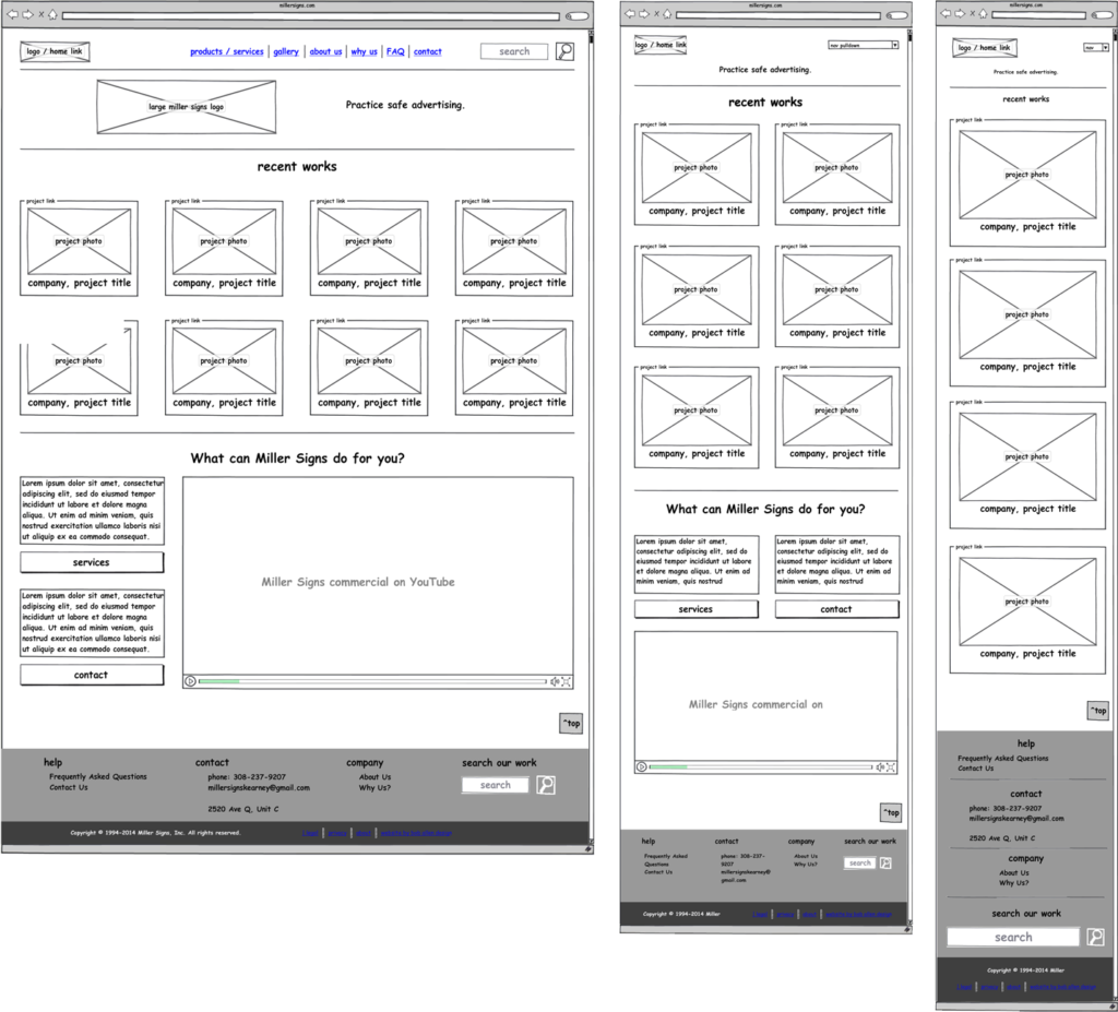
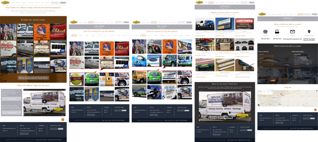
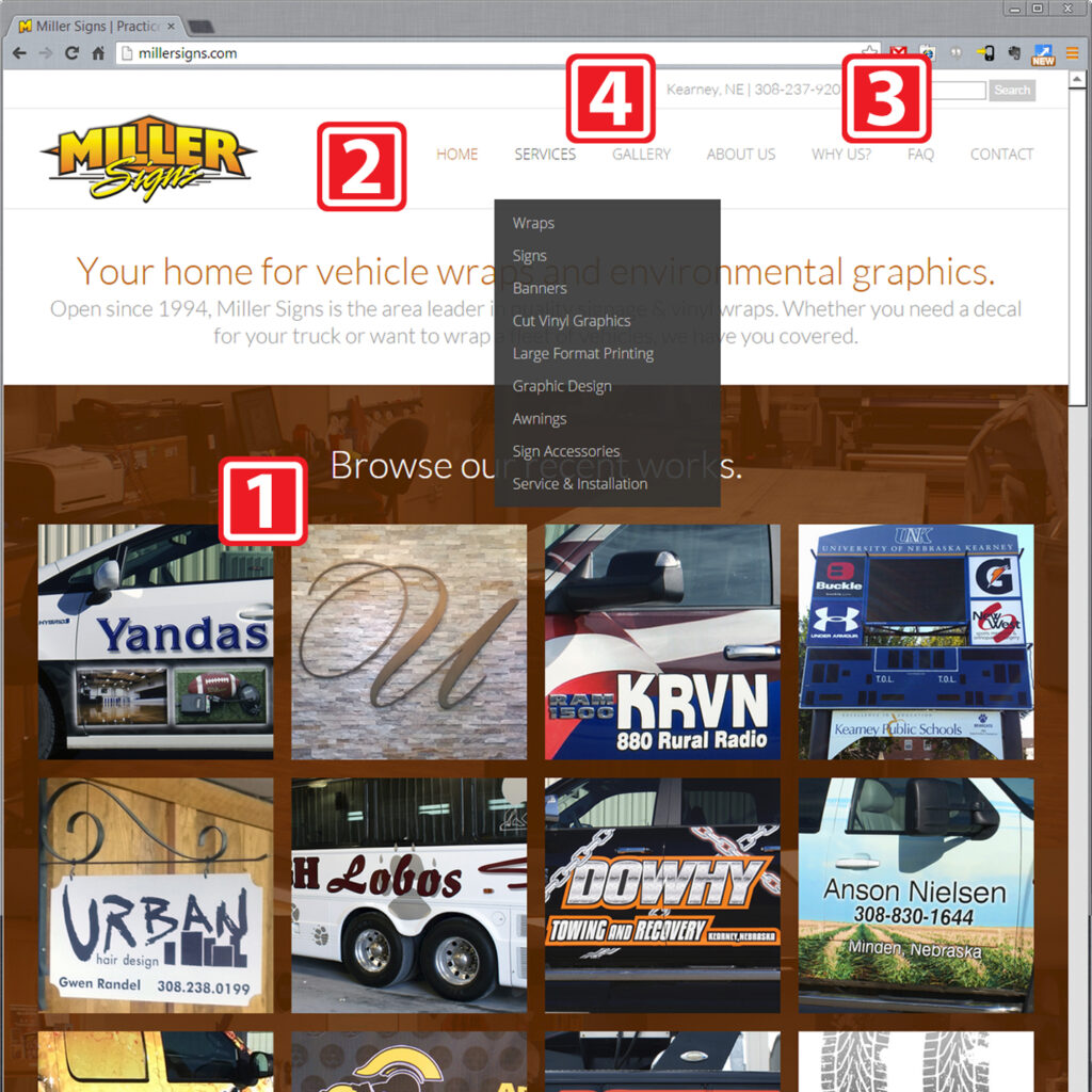
The index page features a large gallery of recent works. One thing people wanted to see most of on the company’s website was projects for refenence and easy access to contact info. Both of these have been achieved through a simple layout that also differentiates the site from other competitors.
- Large, constantly updated gallery
- Full top nav is visually low-key but easily within reach
- Search bar in header and footer allow user to easily find any project
- Contact info in both header and foot for easy access
- YouTube commercial at bottom of page gives user access to short, complete company overview
Services
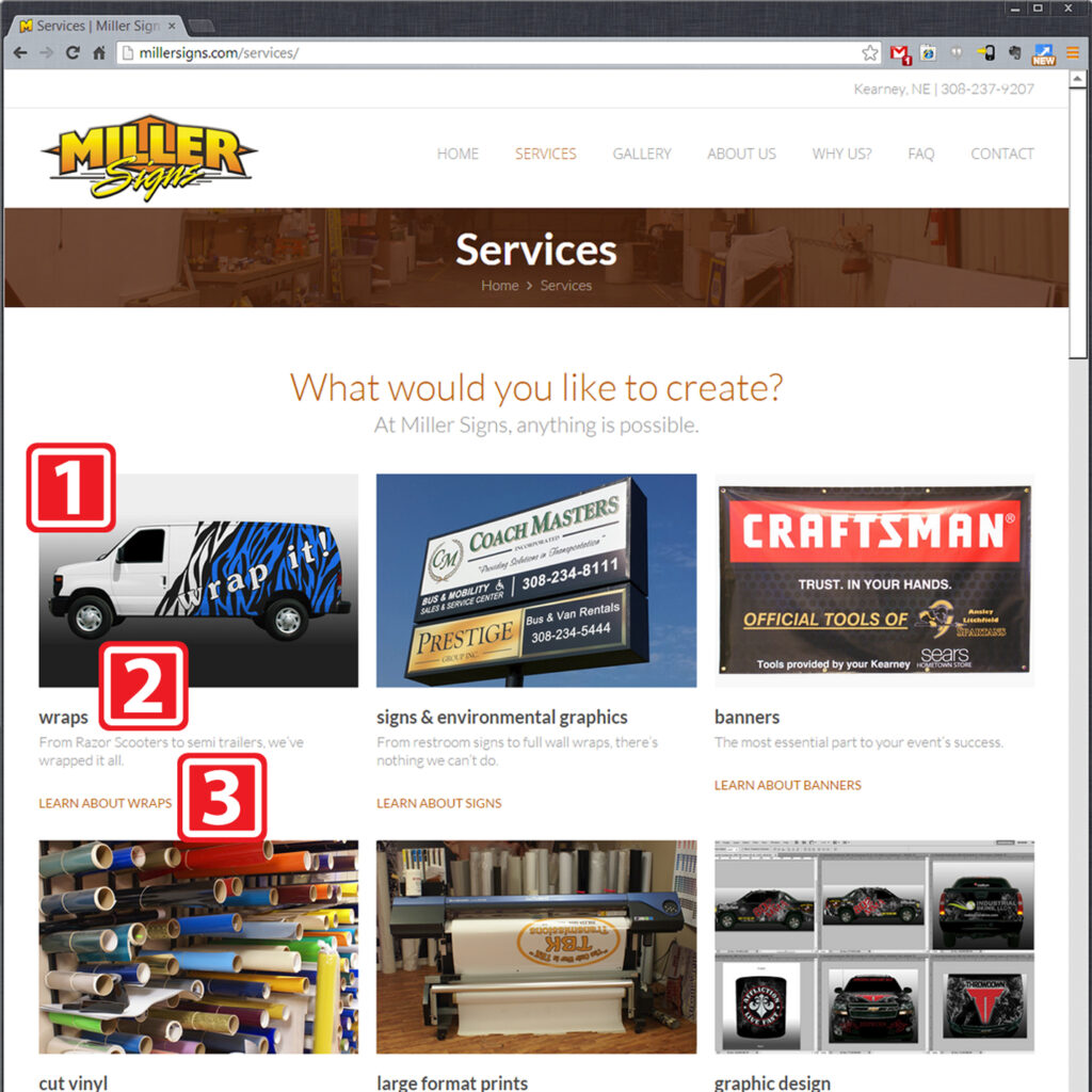
The services page is the gateway to all the business offerings at Miller Signs. Because the company provides a wide variety of services, it was important to make the information easy to get through in a short amount of time. Simple icons were used in liue of photo thumbnails to keep things as visually basic as possible.
- A simple link and example image for each of the service offerings
- Large headings with short but descriptive subheadings
- Links to full pages for the individual services listed
- A YouTube video of the Miller Signs commercial to allow for a quick, comprehensive overview
Gallery
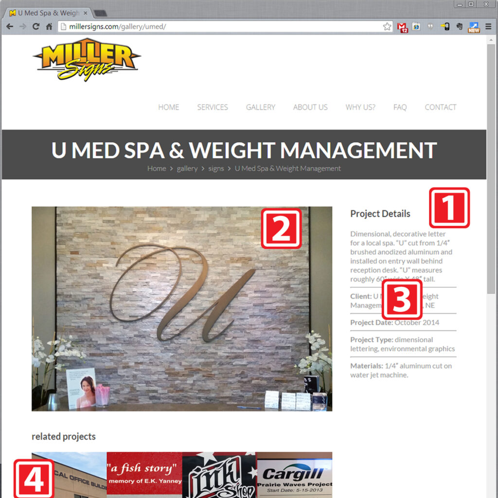
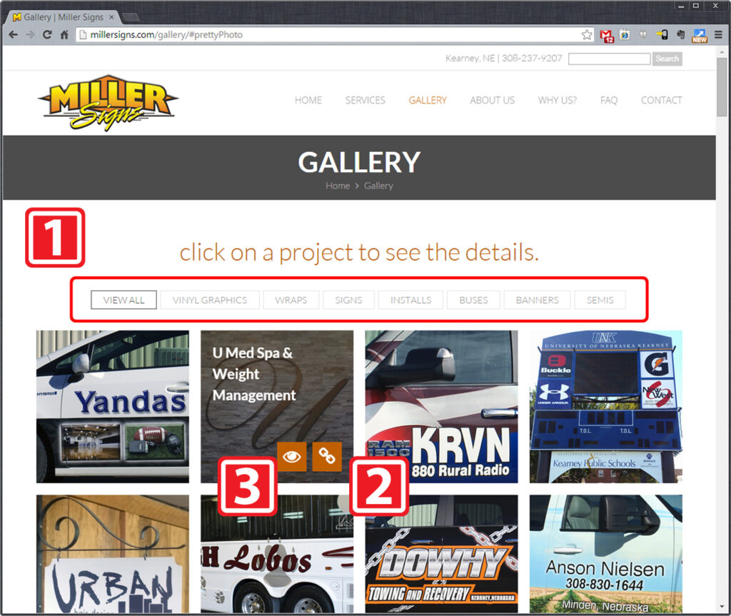
The gallery page is by far the largest content offering on the site. With over 110 individual projects and growing, it is a valuable resource to Miller Signs for customer referrals and internal reference.
- Project filter navigation at top of gallery thumbnails
- Each thumbnail links to an individual page for the project
- Each thumbnail has a quick zoom option to see the photos in more detail
Why Us
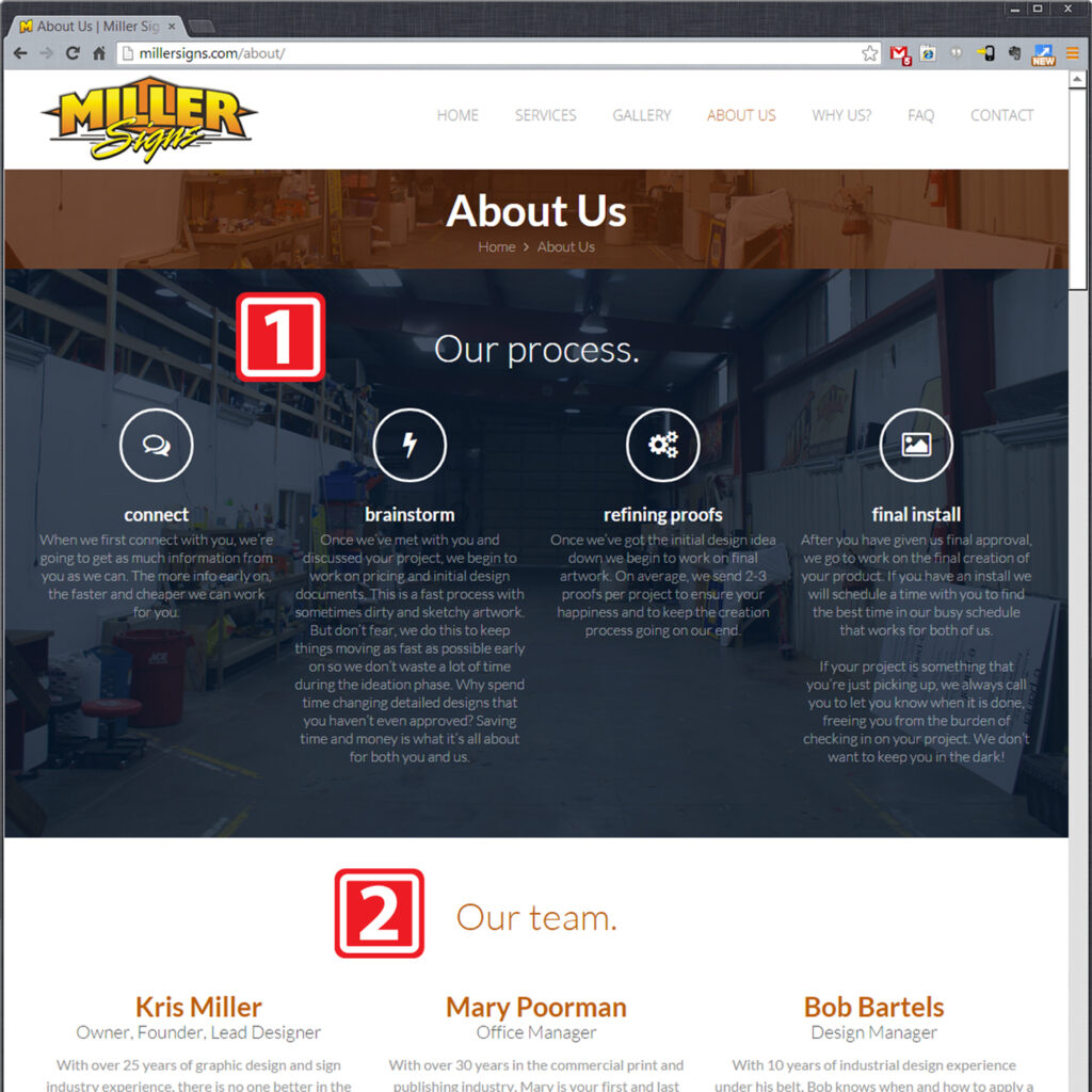
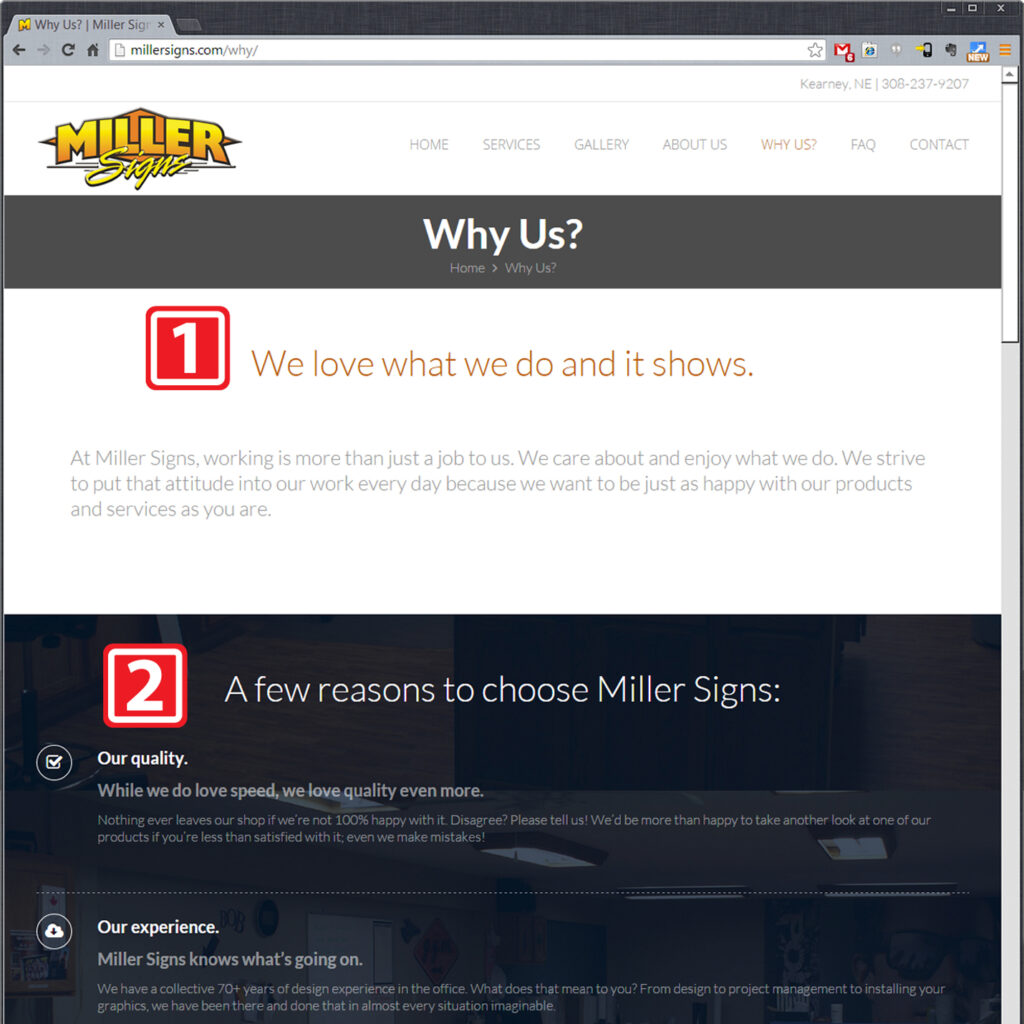
It’s not always easy to choose the right sign company so figuring out a way to help was a bit difficult. In short, the client wanted to be honest and up front with the users at all times about the way she works and what makes Miller Signs the better choice.
- Call to action
- Simple, straightforward bullet points
- Customer testimonials
FAQ
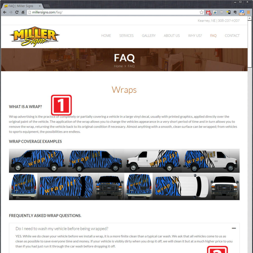
The final frequently asked questions (FAQ) page is a go-to resource for both the end user and company employees. There were several important pieces of info that the client wanted on this page, allowing her easy access to share with customers.
- Examples for each type of service offered
- Tab & acccordion menus make browsing faster
- Large amounts of information in a small area make referencing easy
- Teaching tools help educate the user
- Basic questions about design possibilities
Contact
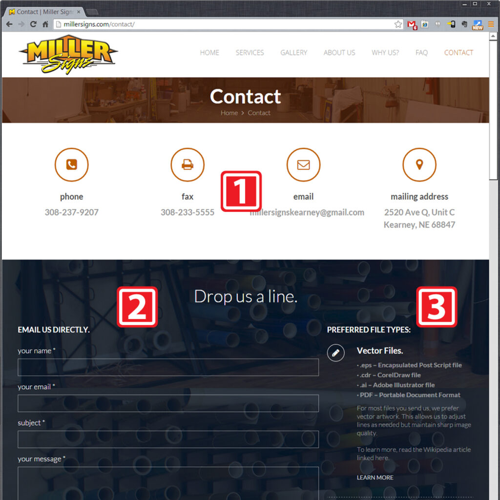
The contact page offers big, bold information touchpoints that make at-a-glance referencing simple. The contact form is also simple and has file reference info in the next column to ensure all parties know what artwork is best for their project. An embedded map link allows the user to either get directions from their phone if necessary.
- Big, bold, simple contact info at top of page
- Simple contact form
- Preferred file type listing helps everyone out
- Map widget for simple interactive location searching
