Clinical Waiting
Improving the patient waiting & service experience.
8 minute read
The Basics
Team
- Cozette Kosary, MA Interaction Design student
- Adriana Guzmán, MA Design Management student
My Role
- User research, space design, rendering
Platform
mobile devices, physical space
User & Audience
Student health center patients
Tools
- Design management, ethnographic research, persona creation, storyboarding, rapid prototyping, user testing, high fidelity mockups, space planning
- Adobe Creative Suite, Axure, Chief Architect X3
Constraints
- Program timing was behind schedule
- Zero budget
- Disjointed teams
- Technical feasibility
The Problem
Challenged with the 2012 theme of “supporting mobile work in healthcare,” students researched the current issues facing a clinical healthcare environment of their choice, determined opportunities for improvement, shared their thought process, and prepared presentations demonstrating solutions that support the mobile work of healthcare professionals by accommodating the demands of the task at hand and supportive technology.
Central Question
How might we… Improve the clinical waiting experience?
Hypothesis
User research and improved technology will combine to reduce wait times, increase provider transparency, and ease patient anxiety while waiting.
Solution
Perform user research and create a concept proposal for improving the KU Student Health Center’s waiting experience
Success
Finalist in 2012 Nurture Collegiate Healthcare Design Competition with project “Nurturing U.” Mentioned in issue of Healthcare Design Magazine, November 2012
Decision: Project Direction
The decision to use the student health center for our problem was made for several reasons. For one, using a building on campus allowed for easier access than a remote location. The fact that it was a university facility allowed us greater access to the staff and facilities than a remote location would have. Finally, the design team was already familiar with the clinic, giving us a head start on identifying areas in need of improvement.
Research
Objective
Identify user pain points and opportunities to improve the clinical waiting experience through the patient’s perspective.
Parameters
- What: Existing patient check-in experience journey, from check-in to filling prescriptions
- Who: 8 patients, all KU students
- Where: Watkins Memorial Health Center, University of Kansas, Lawrence, KS
Test Tasks
- Make a doctor’s appointment
- Check in at Watkins
- Move through the existing clinic environment
Methodology
- Current data analysis
- Evidence-based design
- Stakeholder interview
- Walkthrough analysis
- User interiews
- Participatory observation
Current Data Analysis
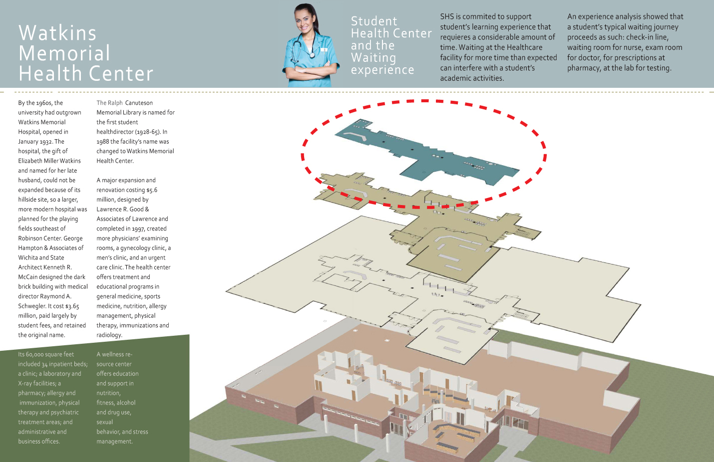
Current data analysis provided the History of Watkins Memorial Student Health Service Center, Online Resources, Floor Plans, and Expectations for the Student Health Center and Waiting Experience.
Evidence-Based Design
We evaluated clinics and how technology was implemented to improve the waiting check-in and waiting experience.
Topics Researched
- Using the phone as a paging device
- Separate waiting areas for sick and well patients
- Alternative waiting areas such as cafes
Stakeholder Interviews
The Interview with Stakeholder: Diana Malott, the Assistant Director of Student Health Services at the University of Kansas, allowed the team to learn what current technology was implemented in the space, how they decide to implement such technology, and what services where offered. It also provided the team with restrictions to follow to meet HIPAA Regulations.
Walkthrough Analysis
Diana Malott led the design team on a Walkthrough Analysis of the clinic’s facilities to showcase furniture, spatial layouts, and technology within the rooms.
User Interviews
The Student Interviews provided the team with information about students’ concerns around privacy, comfort, and communication.
Participatory Observation
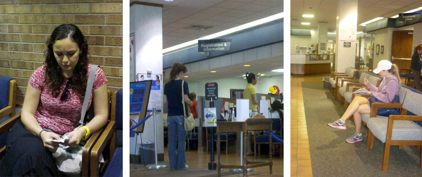
Through Participatory Observation the design team was able to see: how students checked-in, what information was available in the environment, and which waiting areas students chose to sit in.
Insights
Interview Insights
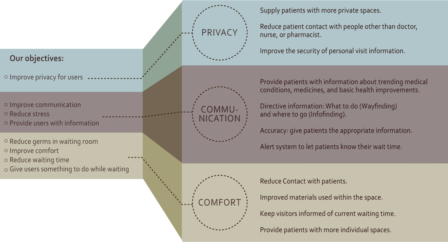
Interview data was filtered down into three simple truths:
- Patients are concerned about both physical and virtual privacy
- Patients want improved staff communication throughout their entire visit
- Patients want to be as comfortable as possible when they feel ill
Spacial Pain Points
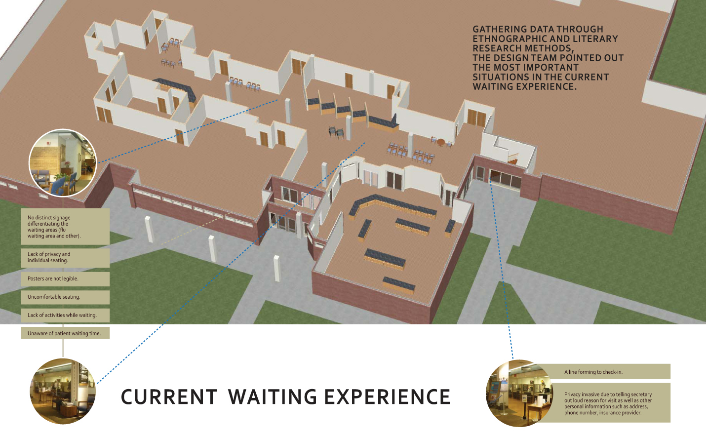
Shown here are highlights of the various problem areas in the existing space. Major problem areas include:
- No distinct signage differentiating the waiting areas (flu area vs. other)
- Lack of privacy and individual seating
- Illegible posters
- Uncomfortable seating
- Lack of activities while waiting
- Unaware of patient waiting time

Example Personas
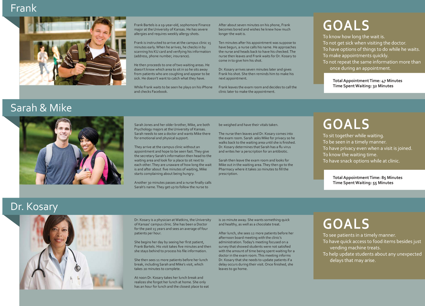
Personas were developed to help condense the large amount of user research data into smaller, easier to analyze clusters. These fictitious personalities provided the design team with a reference on which to base any future user questions such as, “Well what would Frank want to do here?” A very useful tool.
Ideation
Working through the initial problem of which parts of the space need improvement helped us to determine the primary user needs and drove the project direction.
Brainstorming
Several whiteboard sessions took place. This quick and ditry brainstorming method allowed us to work through a large amount of ideas quickly and easily.
Scenario Mapping
Scenario mapping is a very important part of my design process. Using a whiteboard and tall stack of Post-it Notes allows for the creation of several organizational scenarios in a short amount of time. I love this method due to its cheap cost, large scale (making it easy to photograph and share), and ability to easily work with others on a team as opposed to on a sheet of paper.
Testing
Decision: Testing Methods
Simple paper prototypes were used for testing due to their cheap, quick, and effective nature. Google’s SketchUp was also used because it is powerful and free tool that is easy to use and edit content in.
Space Prototyping
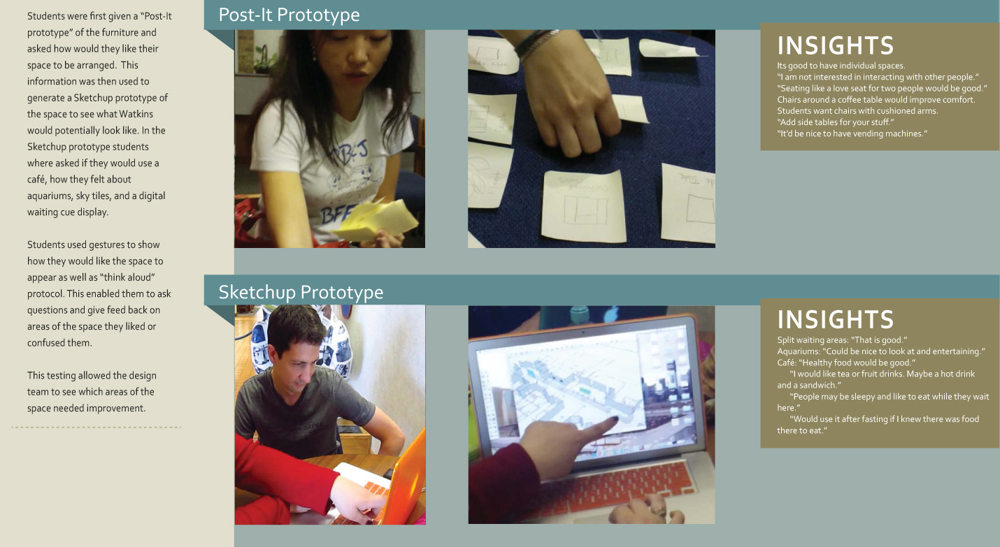
Users were tested and analyzed by using the card sort method, as well as interviewing. Major discussion points included their personal insights on problems they had encountered in the clinic. We also got their feedback on potential solutions we had devised.
Kiosk Prototyping
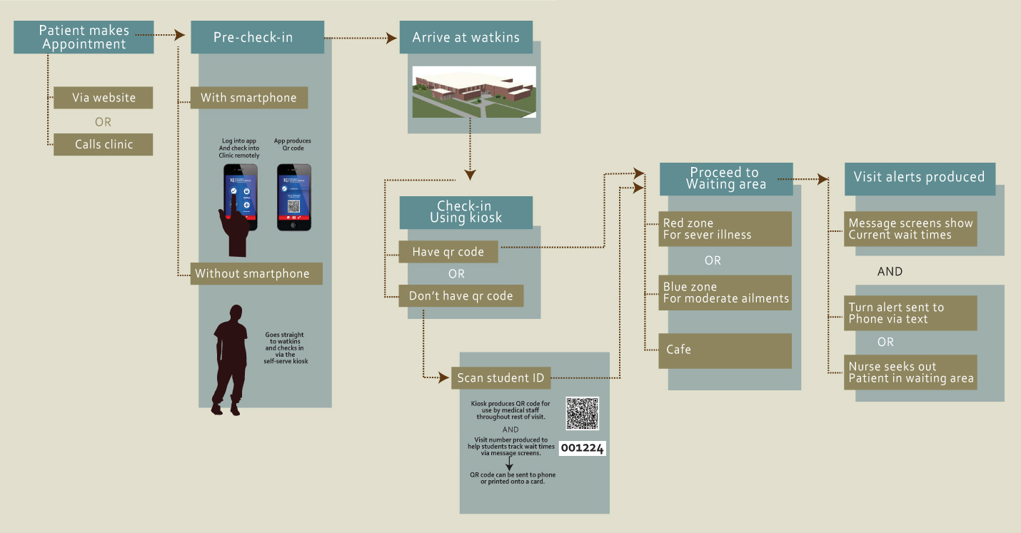
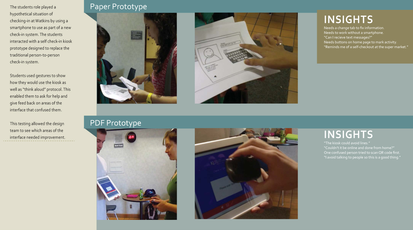
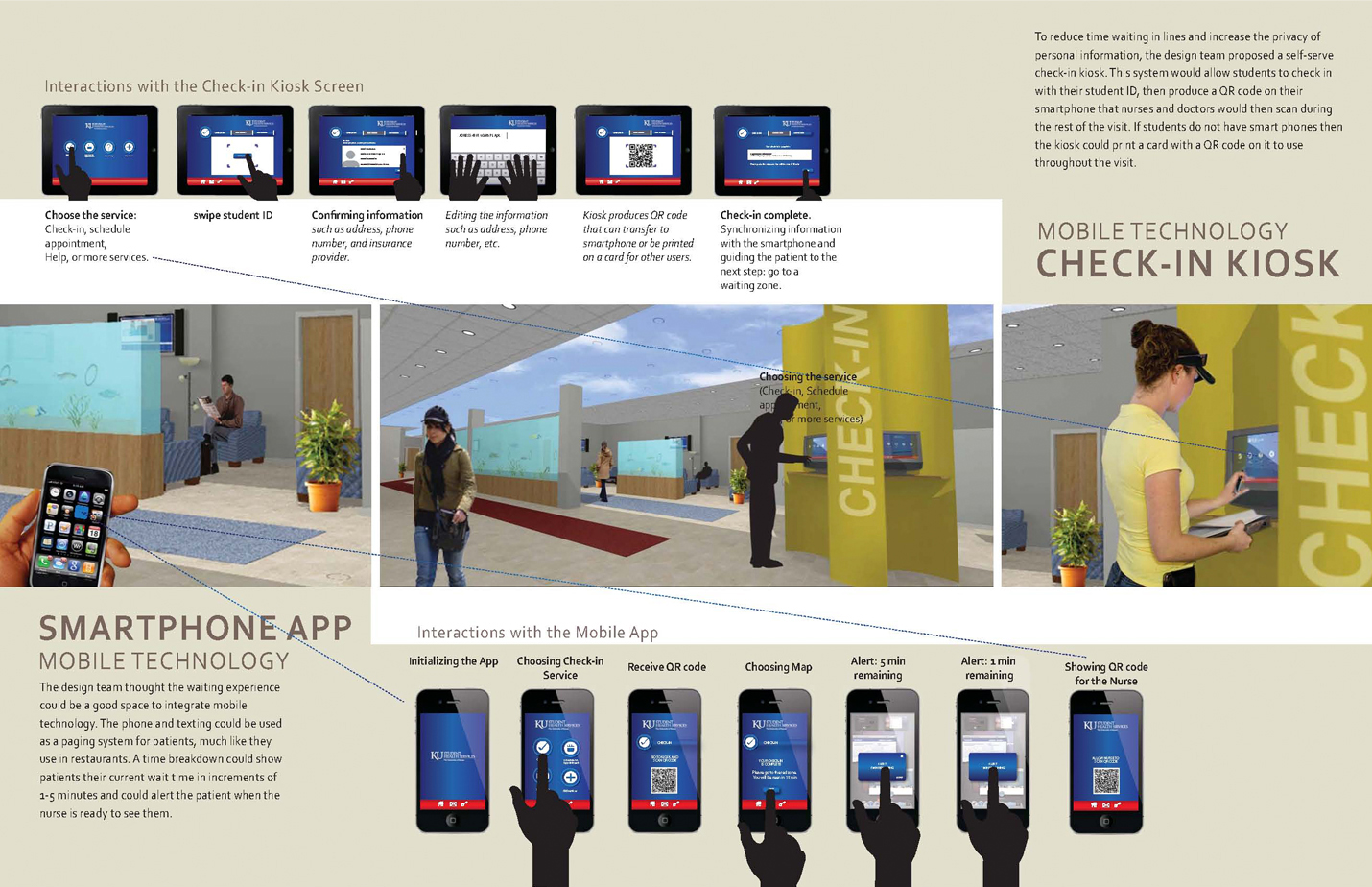
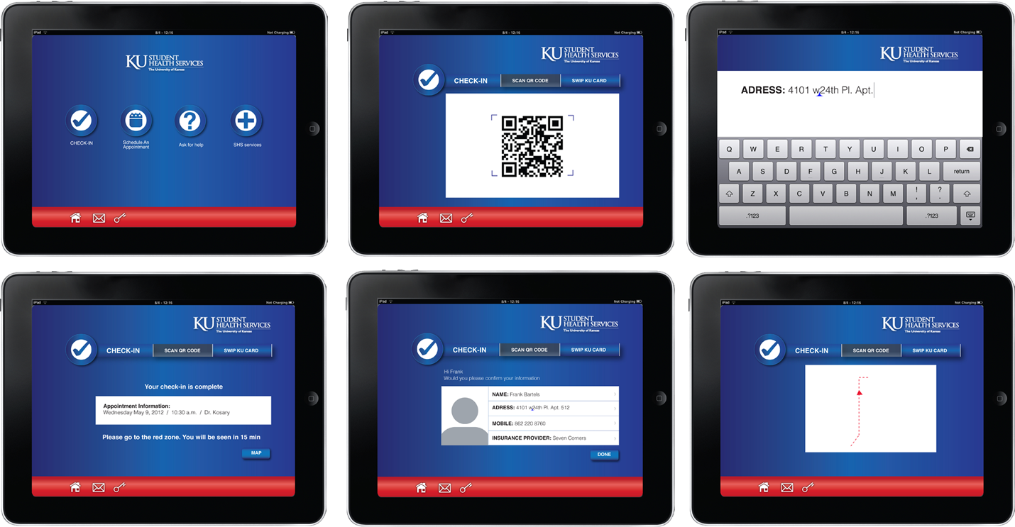
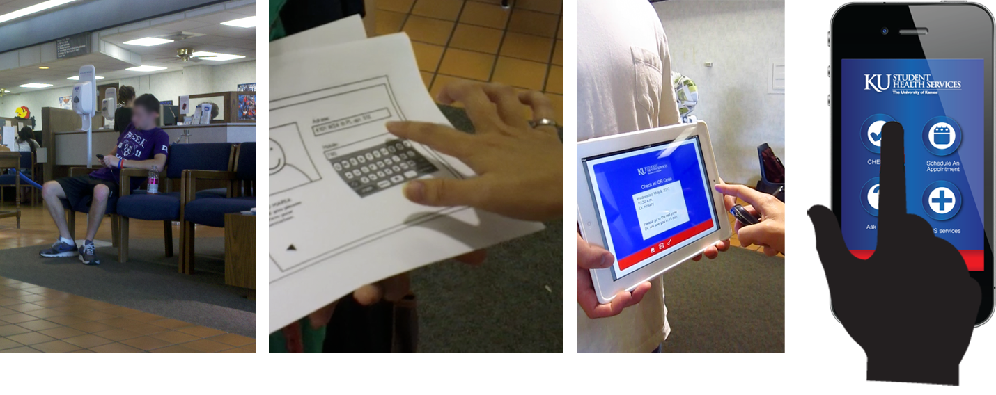
A self check-in kiosk came to play a major part in our redesign, as it would allow improved security and privacy for patients, as well as increased convenience. Users were tested and interviewed with quick paper prototypes, shown to the left.
Phone App Prototyping
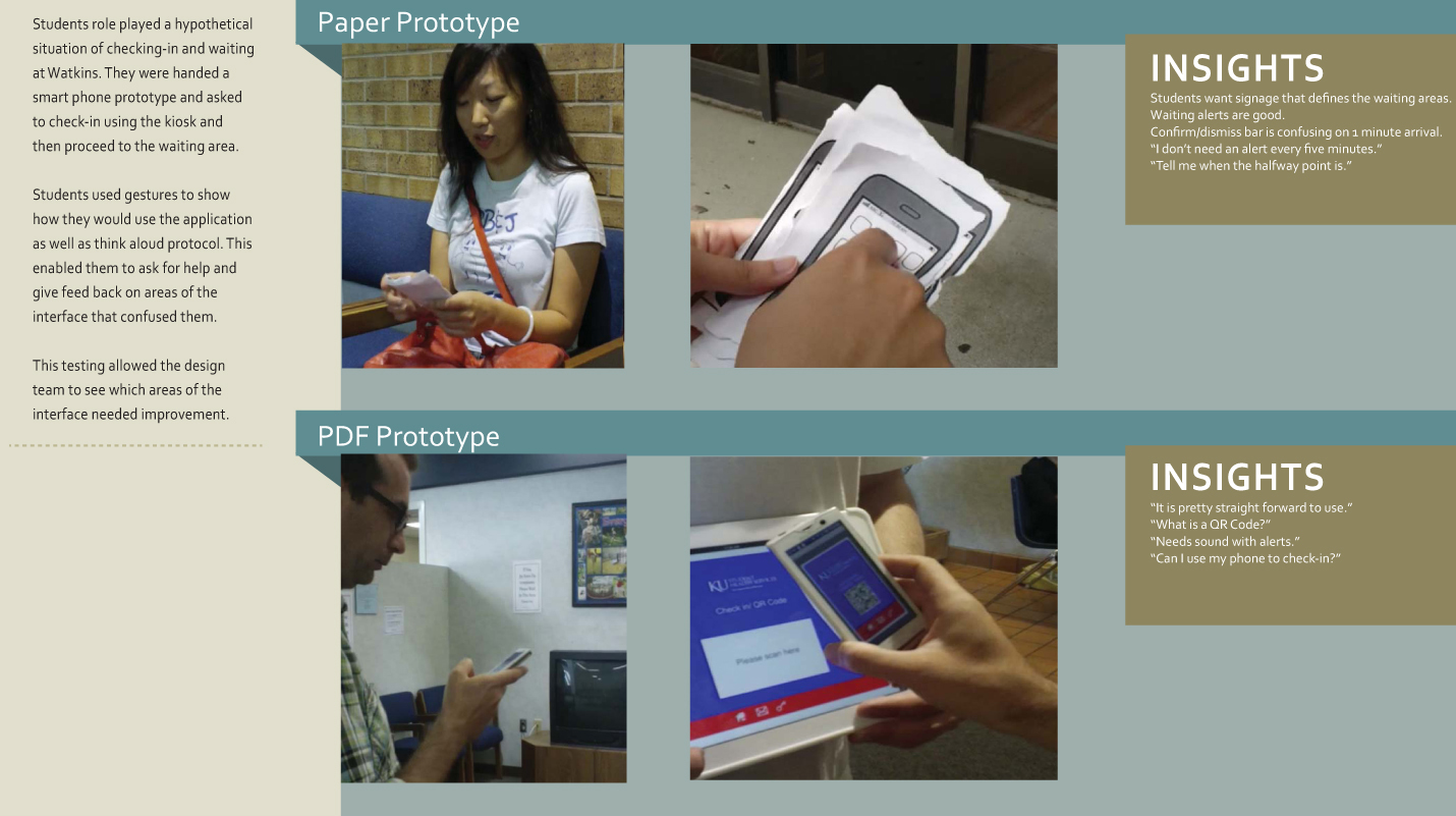
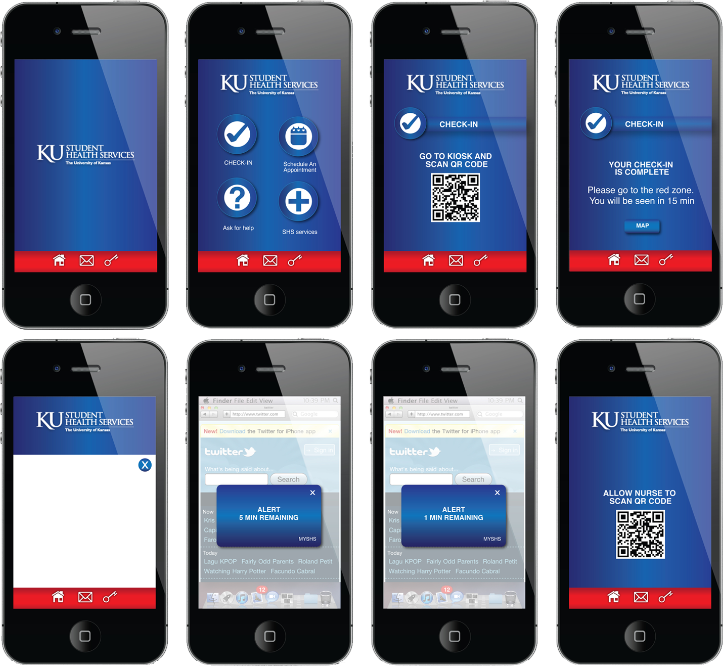
A phone app was envisioned to help increase the communication between patients and the clinic staff. The idea was to allow the app to connect to the clinic to alert patients about waiting times and other critical visit information. Users were tested and interviewed with quick paper prototypes, shown to the left.
Launch
A Better Space For Ill Patients
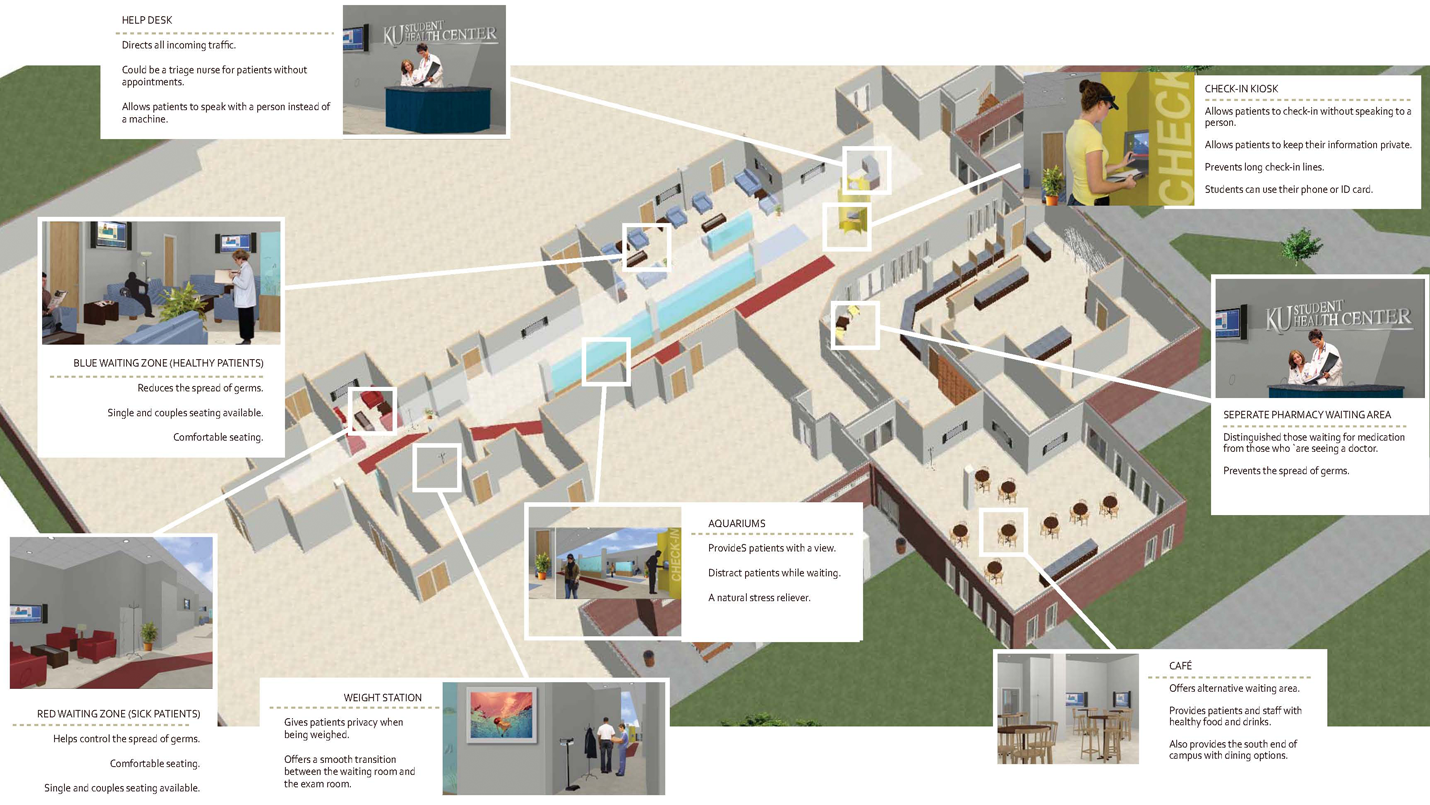
Our final design addressed the three main issues of security, communication, and comfort. Some highlights included:
- A help desk at the front of the lobby
- Zone differentiation for patients of varying illness levels
- Soothing architectural elements such as aquariums and comfortable seating
- A new café to address snacking and relaxation needs
- Seperate waiting area for pharmacy patrons
Healthier Zoning
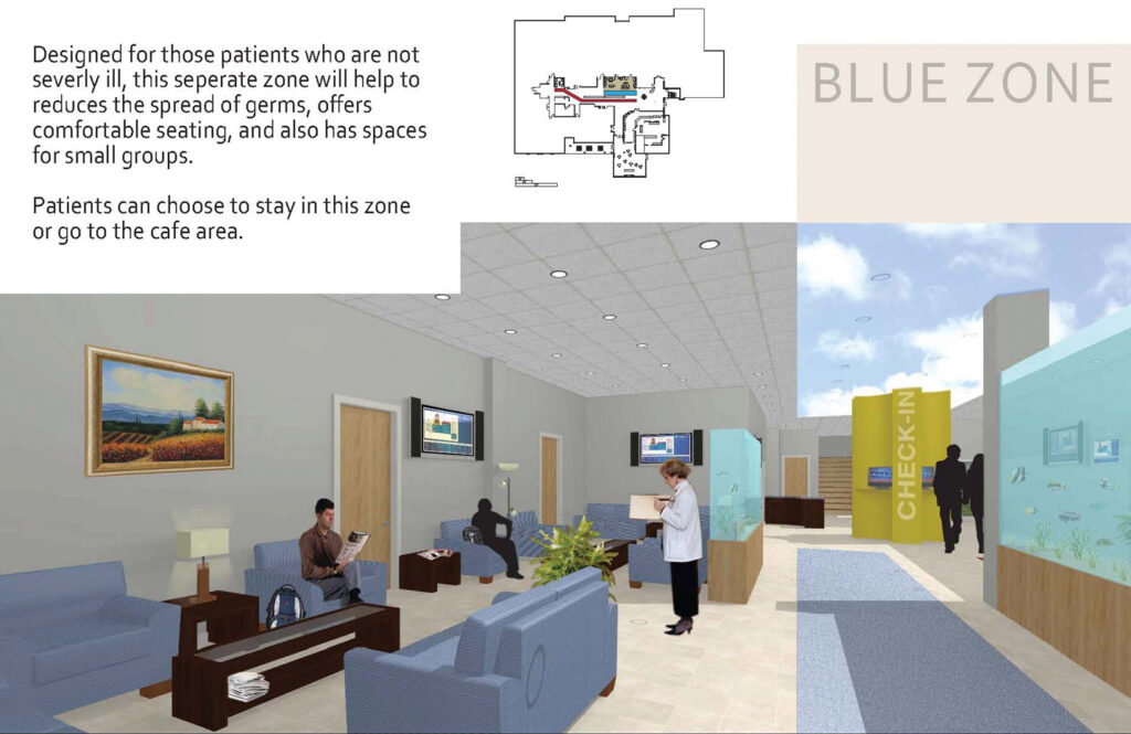
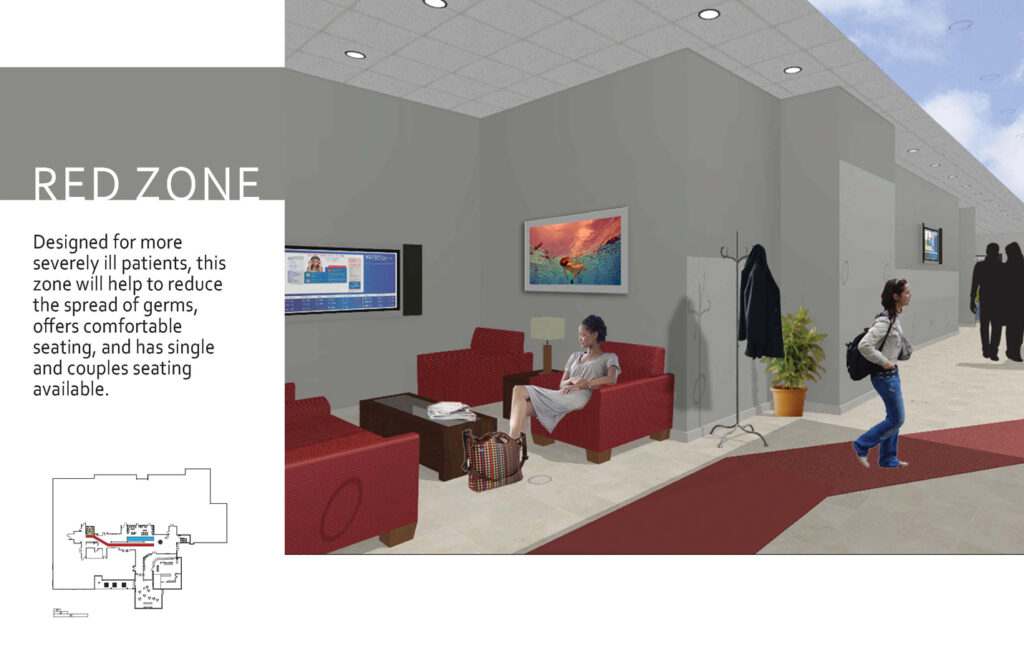
Two zones were designed to keep contagiously ill patients away from the patients with lesser ailments.
The blue zone is a new, comfortable waiting area that utilizes dead space of the old person-to-person check-in space. Increased comfort elements include soft furniture made from germ-repellent fabrics and visually soothing elements such as large fish tanks and ceiling tiles that resemble a cloudy blue sky.
The red zone is the second new zone designed for the more critically ill patients. By separating these patients from those in the blue zone, visitors will be less exposed to more viral illnesses while the staff is better able to control the sanitization of these contagious zones. Increased comfort elements include soft furniture made from germ-repellent fabrics and visually soothing elements such as large fish tanks and ceiling tiles that resemble a cloudy blue sky.
Feed A Cold
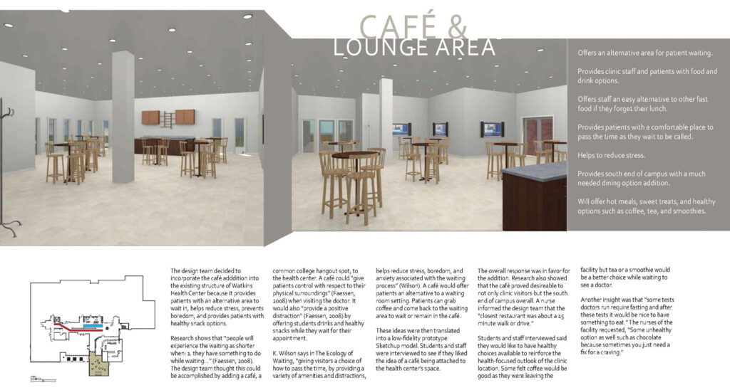
One major desire that arose from both patients and staff interviewed was a better food and drink area. Our proposed idea was to add on a new café area on the west side of the building. We chose to add onto the building as opposed to renovating an existing section because of already tight space restrictions inside. The new space not only serves as a getaway for waiting patients and a quick lunch stop for busy staff, but would also serve the food needs of the south end of campus.
Pharmacy Comfort
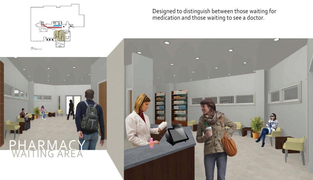
The existing waiting area for the pharmacy was right inside the main entrance, creating an awkward space for both passers-by and those waiting for prescriptions. The renovated pharmacy space incorporates the waiting area inside the pharmacy, allowing customers both a comfortable place to wait, as well as easier access to the pharmacy staff alerting them to ready prescriptions.
Reception & Accolades
- Finalist in 2012 Nurture Collegiate Healthcare Design Competition with project “Nurturing U”
- Mentioned in issue of Healthcare Design Magazine, November 2012
- Mentioned in Steelcase Blog, November 2012
